Making a D3.js bubble chart to visualize lines of dialogue in The Office (U.S.)
/r/dataisbeautiful holds a monthly data visualization battle. For April 2018, the dataset was every line of dialogue in the American version of the TV show The Office.
I’ve been wanting to learn more D3.js so I decided to start by looking at one of the visualizations featured in the D3.js gallery. Jim Vallandingham created this fun viz for the Gates Foundation’s spending. While it’s true that Bubble charts are not really the best way to visualize data for a variety of reasons, I think this visualization is engaging from a UX standpoint.
Mostly, bubble charts can lead to very misleading representations of data. But after playing around with Vallandingham’s viz, I wanted to apply it to my Office dataset. The first thing I wanted to ask—who speaks the most? Michael Scott is the boss of Dunder Mifflin. He obviously has a lot of lines throughout the show, but who else has the most dialogue? Is it consistent across the seasons of the show? The second thing I wanted to know—what were the top words characters used? Will “tuna” show up as Andy’s favorite word?
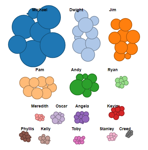
Bubble size corresponds to the number of lines a character has per season.
I wanted to perform exploratory data analysis to start. I used Python’s pandas library and Jupyter notebooks.
EDA and cleaning the data with pandas
I started with “the-office-lines.csv” file. Every line is represented as a row of data in this CSV file. Each line has an ID, season, episode, scene, text, speaker, and an indication (“True” or “False”) of whether or not the line is part of a deleted scene.
This is a different structure than the Gates Foundation dataset the data has organizations, amounts, and years. Since I wanted to reuse Vallandingham’s code for The Office dataset, I had to reformat the data in a different way.
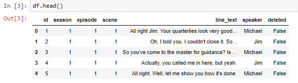
The result of a df.head() of The Office dataset.
To make things simple for my visualization, I’ll simply count the number of lines per character for each season. The greater the count of lines for a particular character in one season, the larger the bubble will appear in my viz.
df.groupby(['speaker','season']).size().reset_index().rename(columns={'index':'speaker', 0: 'count'})
In this line of code, I’m telling pandas to group the DataFrame by “speaker” and “season,” the two columns I’m interested in. With that groupby object, I want the row counts (size) for each speaker in each season. Finally, I’m setting the index to be the speaker, not the individual ID of each line of text.
s.to_csv('the-office-counts-by-season.csv')
I export the newly cleaned-up DataFrame and I’m ready to work with the data in D3.
Merging the data into D3
D3 is new to me. I’ve been finding the prospect of starting a D3 viz from scratch very daunting so I’ve been admiring the vast D3 gallery and tinkering around with Mike Bostock’s blocksin trying to make some stabs at understanding how it works.
When I found the Gates viz, I figured The Office dataset would be a nice little fork of the project. And I could experiment with the grouping function Vallandingham set up—instead of grouping by year, I’d group by season. If I could do that, I’d try to group by some other parameter—perhaps by main character. And if all that looked okay, I’d do some more data preparation and make a bar chart of a character’s word frequency appear for a particular season.
But let’s not get overly ambitious. All I wanted to do was see bubbles appear for various characters in The Office. Start small.
To start, I cloned Vallandingham’s GitHub repository and fired up my http-server:
http-server
I successfully got the bubble chart going on my local server! From here, I started by diving into the main “vis.js” file. The starting point for me was to simply replace all references to “year” with “season.” After that, I could also replace the Gates CSV with the dataset I’m interested in and see if I could get the groupings to work.
Since Vallandingham laid out his JavaScript (or originally CoffeeScript) in an object-oriented way, this was pretty straightforward. All the prototypes I will change inherit from the BubbleChart object constructor.
// season group
this.hide_seasons = __bind(this.hide_seasons, this);
this.display_seasons = __bind(this.display_seasons, this);
this.move_towards_season = __bind(this.move_towards_season, this);
this.display_by_season = __bind(this.display_by_season, this);
For the centers of the bubble groupings by season, I made room for nine different clusters instead of three.
The create_nodes prototype of the BubbleChart constructor defines each bubble based on the datum and pushes nodes of the data into an array. I have to adjust this prototype to reflect my dataset’s features—count, speaker, and season:
BubbleChart.prototype.create_nodes = function() {
 this.data.forEach((function(_this) {
   return function(d) {
     var node;
     node = {
       id: d.id,
       radius: _this.radius_scale(parseInt(d.count)),
       value: d.count,
       speaker: d.speaker,
       season: d.season,
       x: Math.random() * 900,
       y: Math.random() * 800
     };
     return _this.nodes.push(node);
   };
 })(this));
 return this.nodes.sort(function(a, b) {
   return b.count - a.count;
 });
};
Here, the radius of each node is defined by the character’s count (number of lines of dialogue in a season). The x and y coordinates, the position of each bubble within the SVG element, is random.
I also changed the show_details object prototype of the BubbleChart constructor:
   BubbleChart.prototype.show_details = function(data, i, element) {
     var content;
     d3.select(element).attr("stroke", "black");
     content = "<span class=\"name\">Speaker:</span><span class=\"value\"> " + data.speaker + "</span><br/>";
     content += "<span class=\"name\">Number of lines:</span><span class=\"value\"> " + (addCommas(data.value)) + "</span><br/>";
     content += "<span class=\"name\">Season:</span><span class=\"value\"> " + data.season + "</span>";
     return this.tooltip.showTooltip(content, d3.event);
   };
This way after hovering over a bubble, the character’s name, number of lines spoken, and the season number will appear.
Wrap-up
This wasn’t meant to be an exhaustive tutorial of how to make a BubbleChart in D3.js. If you really want to dive into the mechanics of how this works, I recommend following Vallandingham’s excellent tutorial. He walks through the code in a helpful way and gives a good overview of D3’s Force Layout feature, something I didn’t discuss here. Essentially, there are a ton of attributes you can play around with that govern each bubble’s physics.
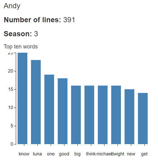
One of Andy’s favorite word was tuna